Nursery Topweights - A Lesson in Sampling
|
|
Nursery Topweights - A Lesson in Sampling |
|
|
Article 12_009_1
15th February, 2012 |
The advice in the saying above will be familiar to anyone who follows racing, along with others such as backing the "outsider of three". An Article written in 2006 was published on this site which looked at the results that would have come from backing all of the topweights in Nurseries that season. The overall return would have been a miniscule profit at Starting Prices (SPs) but a profit so an interesting result. The reader here is advised to consult that earlier article because this piece adds to the items covered there.
The 2006 article split the Nurseries down further by Month and also Race Class to see if any patterns showed up. One possible trait that appeared was that none of the topweights in the lowest quality (Class 6) races won. But, the article also made the point that the sample size of 135 total races, and 165 topweights including those joint ranked, was small and would need further work to prove any patterns were 'real' long-term effects. Splitting the 165 total topweights by race class produced just 16 & 18 representatives in the top Class 2 and lowest Class 6 categories. Clearly not enough to prove anything but the overall result of a profit seemed to have some value.
This article reports on the results of extending the 2006 approach to cover the seasons 2004 to 2011. The biggest lesson that comes out of this is to hammer home the point about sample sizes. The 135 races of 2006 was too small and mostly misleading in the results it hinted at. Like trying to be definitive about the geological and chemical make-up of Mars by extrapolating the information received from a probe working in an area of a few hundred metres. Depending how, irreducably, complex things are you might 'sample' everything and find nothing that is a real underlying pattern. A recent e-mailer to the worthwhile pundit on ATR wanted to give up on his approach to analysing races because he had found 8 discouraging examples. The pundit made it clear that 8 was a ridiculously low number and he needed thousands of races in his sample to get close to proving anything. Quite.
Section 2 below gives a summary of all the returns 2004 to 2011 split by year and compared to each other. This shows up starkly how unusual the 2006 final result was and misleading because of that. The section also shows the Return on Investment (ROI) for each year split by Race Class and Month to see how that varies across the years. Section 3 compares the detailed results for 2006 to those for 2011 and these show up a number of issues about how the number of Nursery races has changed over that period. Section 4 considers how well those close up in weight to the topweight fare as the season develops and then Section 5 pulls together some thoughts as 'Conclusions' within the scope of the sample size here.
The 2006 Article provides more details of the overall approach for this survey and therefore this section will just consider the results. The first table shows a single line summary for each year giving the number of Nursery races, total of topweights including joint topweights, the race wins achieved and the Strike Rate of all the topweights. The final column labelled "ROI" gives the 'Return On Investment' that would be made by having a £1.00 level stake bet on every nursery topweight at SP in the season. The numbers are colour coded Red for Losses and Green for Profits.
| Year | Total Races |
Total Topweights |
Topweight Wins |
Strike Rate |
ROI |
| 2004 | 129 | 155 | 22 | 14.2% | -0.43 |
| 2005 | 134 | 155 | 23 | 14.8% | +0.26 |
| 2006 | 135 | 165 | 25 | 15.2% | +0.004 |
| 2007 | 161 | 235 | 26 | 11.1% | -0.39 |
| 2008 | 160 | 204 | 27 | 13.2% | -0.23 |
| 2009 | 184 | 229 | 32 | 14.0% | -0.19 |
| 2010 | 200 | 244 | 38 | 15.6% | -0.32 |
| 2011 | 184 | 238 | 35 | 14.7% | -0.23 |
With the usual caveat about sample sizes a look through the table would produce some general observations. Firstly, that the small profit in 2006 followed a solid one in 2005 but that those two years seem exceptional. Look through the other years, including all those since 2006, and you might suggest that a punter should expect to lose between 20% to 40% of their total investment by backing topweights in Nurseries. A totally different conclusion to just 'sampling' 2006, or 2005-6, to make the point clearly.
Looking at the number of Nursery races these have increased notably since 2006 with the high point of 2010 representing a 50% increase in total races over 2006. But, looking at the topweight wins achieved and the Strike Rates it is not apparent that anything has fundamentally changed with the increases.
A question then arises surrounding what happened in 2005-6 which gave good returns on typical Strike Rates? One answer could just be natural variation with small sample sizes. A few 33/1 winners who only place in other years would be enough to flip things over. The equivalent of getting 8 'Heads' in a row during a long trial of tossing a coin. Another hypothesis might be that the Betting Industry was going through notable changes at that time. During the initial period of strong competition between Bookmakers of various types, including those using exchanges, did the SP returns become more favourable? Were the bookmakers' margins non-existent at times? If so, then the Market managed to 'right itself', with experience, to get back to the normal position of siphoning off a percentage of punters' money on a regular basis. That perhaps makes the Betting Market's approach a confounding variable in any study of this type.
The 2006 article chose two variables to split the Nursery races down by to see whether any interesting patterns emerged. There are many variables that could have been chosen but Race Class and Month seemed to offer some understandable differences. Separate Race Classes involve horses of different qualities and would topweights perform similarly in any quality range? The 2yo handicap builds up afresh each year and as the season progresses the BHA handicapper has more information to base his ratings on and there are many more horses eligible to run in nurseries. Given this it was worth checking how the returns developed each month as the season unfolded.
The table below shows a single line for each Season and then the ROI achieved by all topweights in the 5 different Race Classes. The Race Class structure was changed between 2004 & 2005 and the figures for the first of those years is therefore not included.
| Year | Class 2 |
Class 3 |
Class 4 |
Class 5 |
Class 6 |
| 2005 | -0.82 | +0.11 | +0.22 | +0.34 | +1.55 |
| 2006 | +0.66 | +0.38 | -0.15 | +0.19 | -1.00 |
| 2007 | -1.00 | -0.26 | -0.57 | -0.52 | -0.01 |
| 2008 | +0.10 | -0.44 | -0.65 | +0.42 | -0.75 |
| 2009 | -0.46 | -0.91 | -0.36 | +0.46 | -0.55 |
| 2010 | +0.68 | -0.90 | -0.13 | -0.22 | -0.36 |
| 2011 | +0.08 | -0.18 | -0.17 | -0.55 | -0.05 |
Remember that the single ROI figure given is based on small samples and around 20 for some cells. If we also assumed that some external influences affected the good returns in 2005-6 then perhaps we should just look at the 2007-11 years as a set. The small sample show up with huge variations in returns between years within a Race Class. The highest level races in Class 2 show three profits in the last five years but two above average losses in the other two. No real pattern there.
Class 4 Races show a loss every year but have produced two below average losses in 2010-11. How 'Real' is that or is it just natural lumpiness in the figures? The Class 6 races which produced a 100% loss in the profitable overall year of 2006 have a variable record since. A single average loss and two big ones but two other years where the loss is very low at 1% & 5%. Not sure you should be reaching for any theories on the set on numbers in this table.
The table below also shows the ROI figures in each year but split by Month and the figures for 2004-5 are not included for technical reasons.
| Year | July | August | September | October | November |
| 2006 | +0.11 | -0.04 | +0.36 | -0.81 | +0.86 |
| 2007 | -0.29 | -0.64 | -0.33 | -0.18 | -0.87 |
| 2008 | +0.02 | -0.44 | +0.03 | -0.33 | -1.00 |
| 2009 | +0.11 | -0.39 | -0.29 | -0.05 | -0.44 |
| 2010 | -0.08 | -0.18 | -0.53 | -0.23 | -0.76 |
| 2011 | +0.18 | -0.19 | -0.63 | +0.09 | -0.69 |
If you ignore the 2006 figures then you might venture that the July figures look better than average overall and the November figures worse than average. The July figures are consistent enough to believe that there really is some affect in the earliest nurseries which means the topweights are more competitive overall. The fact that this is early in the season while the 2yo handicap is still developing could well mean that July nurseries are 'different' in some way. Certainly worth investigating further.
As a speculation you might suggest that a July bias would help to perpetuate the 'Back the Topweight' idea. When the nurseries begin the Pundits have little grasp on them so will fall back on lightweight phrases like that. Later in the season they can treat nurseries more as 'Business as Usual' and talk about them in whatever form summary approach they might employ. The 'Back the Topweight' phrase only getting aired then when the Topweight has just won the last race.
Whether the poor results in November can be relied on is less certain. There are only a small number run each year in the 5-10 days of the month that the season extends into. They are different as a group to the July nurseries in many ways. Apart from the relative development of the handicap they are at distances up to 10 furlongs and often with bigger fields on softer going. It might encourage you to look at whether Race Distance had any effect on the Topweight returns in Nurseries.
The previous section gave single line figures for each season that allowed years to be summarised and compared. That approach is useful but hides some of the details about individual years including the actual sample sizes in any categorisation. In this section there are two table presented for each split by Race Class & Month. These give the full figures for the pair of seasons of 2006 and 2011 to allow any changes to show up in comparison.
This first sub-section deals with Race Class and the first table below gives the figures for 2006.
| 2006 Race Class |
Total Races |
Total Topweights |
T/w Wins | Strike Rate |
ROI |
| 2 | 14 | 16 | 2 | 12.5% | +0.66 |
| 3 | 15 | 17 | 3 | 17.6% | +0.38 |
| 4 | 46 | 55 | 10 | 18.2% | -0.15 |
| 5 | 46 | 59 | 10 | 16.9% | +0.19 |
| 6 | 14 | 18 | 0 | 0% | -1.00 |
The following second table in the first subsection gives the full Race Class details for the year 2011.
| 2011 Race Class |
Total Races |
Total Topweights |
T/w Wins | Strike Rate |
ROI |
| 2 | 16 | 22 | 3 | 13.6% | +0.08 |
| 3 | 13 | 14 | 2 | 14.3% | -0.18 |
| 4 | 48 | 53 | 10 | 18.9% | -0.17 |
| 5 | 58 | 76 | 8 | 10.5% | -0.55 |
| 6 | 49 | 73 | 12 | 16.4% | -0.05 |
There are two items to highlight from comparing the tables. The first is that there has been an increase of 49 nurseries in 2011 compared to 2006 or 36%. This high number of new events has not been split equally across the Class bands. There were 35 extra races in Class 6, 12 in Class 5 and 2 in Class 4 with the same total of 29 spread, a little differently each year, across the top two classes.
This is a 250% increase in Class 6 races and this might have changed the character of the nurseries in this grouping. For example many of the new races were on the All-Weather (AW) in later season and with very narrow ranges of weights. Divided nurseries with 5lbs range from topweight to bottom for example. Investigating further whether the increase has changed the types of Class 6 events would be useful. Splitting the nurseries between turf and AW surfaces might be interesting to investigate, for example.
The other point to note is the large variability shown between returns for comparable groups across the two seasons. Indicating that even sample sizes around 50 races per category is insufficent to smooth out the variability in the returns.
This second sub-sections produces the full details for each Month in the years 2006 and 2011. The following table presents the data for 2006.
| 2006 Month |
Total Races |
Total Topweights |
T/w Wins | Strike Rate |
ROI |
| Jul | 20 | 22 | 4 | 18.2% | +0.11 |
| Aug | 38 | 39 | 9 | 23.1% | -0.04 |
| Sep | 46 | 62 | 10 | 16.1% | +0.36 |
| Oct | 25 | 35 | 1 | 2.9% | -0.81 |
| Nov | 6 | 7 | 1 | 14.3% | +0.86 |
The following table in the second sub-section presents the fill Nursery data split by Month for 2011.
| 2011 Month |
Total Races |
Total Topweights |
T/w Wins | Strike Rate |
ROI |
| Jul | 26 | 31 | 8 | 25.9% | +0.18 |
| Aug | 50 | 68 | 10 | 14.7% | -0.19 |
| Sep | 55 | 68 | 6 | 8.8% | -0.63 |
| Oct | 43 | 57 | 10 | 17.5% | +0.09 |
| Nov | 10 | 14 | 1 | 7.1% | -0.69 |
The first point to note in comparing the two tables is that the extra 49 races in 2011 have been split as 6 extra in July (30% more), 12 in August (32%), 9 in September (20%), 18 in October (72%) and 4 in November (40%). The 2006 loss was a particularly poor figure for October and the 5 years since have produced average losses or better each year. Whether this is normal variation or the increase in races affecting the returns would be useful to study.
As with the previous pair of tables for Race Class the other main item to note for the Months split is the large variations between the pairs of months that show up. Primarily because of low sample sizes.
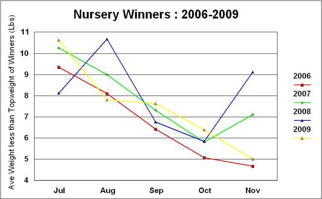
The 2006 article included details of the average amount of weight less than topweight the Nursery winners in each month carried. If all races were won by topweights then this figure would be zero for example. The more winners from lower down the handicap rating in each month there are the figure gets larger. Note that one pound of weight (1lbs) is equal to one rating point in the handicap.
In 2006 this figure showed a smooth decrease each month from being at around 9lbs average in July down to around 5lbs in later season. Which means the average winner is higher up the handicap and closer to the topweights' rating in early Nurseries. Because the figure is an average the distribution of winners in the handicap could produce the figure in a number of ways. But, one question was whether that decrease that showed up in 2006 'Real' or just an oddity?
The following line graph shows the monthly figures for 2007-9 alongside the line from 2006. While there are differences and something odd happened in August 2007 the lines have a similar path to them. The November figures vary a lot because they rest on as few as 5-10 races overall. But, the July-August figures are in the 8-11lbs range and the October figures are between 5-6.5lbs. Note that the line graphs should really be Bar Graphs to be presented correctly but the lines show the trends more easily if blurring the discrete nature of the monthly averages.
Which is interesting but what is the decrease telling us? What compresses the winners closer to the topweight range in later season? Suggestions welcome. But, then another spanner in the works. The line graph below shows the same information plotted for 2010-11. What has happened? The paths for the two years are similar to each other but they are very different to 2006-9. The July to August peak has gone and the averages are mostly flat between July to October in the 5-7lbs range. The November figures still vary a lot and perhaps this is the small sample effect but might be a different cause.
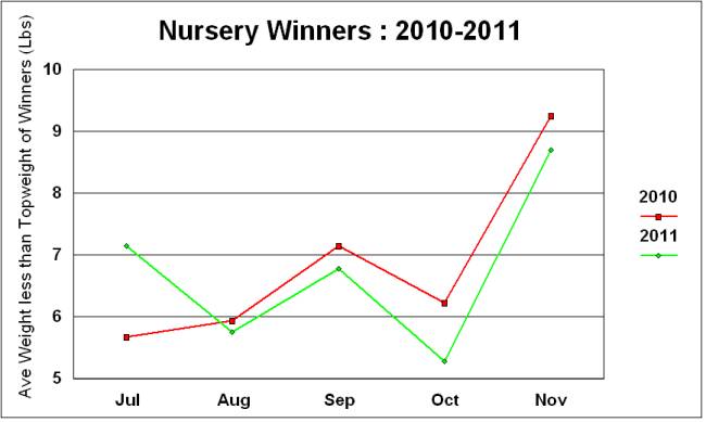
Is the change real or another oddity and the 2012 line will fit well into the 2006-9 set? If it is real then what does it actually mean? Perhaps the increase in numbers of nurseries affected the balance. Maybe the BHA handicapper has started doing something different in an attempt to make the ratings better. Does something strange like the weather patterns affect the results? Drier summers and consistent form on Good to Firm going producing a tighter handicap. As noted above the August 2007 figure is notably high and out of line with the 2006-9 general pattern. What was the weather like in July-August 2007? That was the year of torrential rain through the midsummer with Newbury races cancelled in late July with the course and the M4 nearby under water. Look at the nursery races in August 2007 and more than half on turf were run with Soft or Heavy in the going reports. But, still somewhat baffling overall.
The single largest lesson from extending the survey from one season in 2006 to to eight years has been that a sample of at least that size is needed to see the overall pattern in results. Even with an eight season sample the developments in race planning along with issues such as changing weather conditions mean that low level patterns may be masked. Using a single season as a sample brought about a false conclusion because 2006 was so different to the average year. It is possible that the changes in the British betting industry in 2005-6 contributed to the unusually good returns.
The second conclusion from the extended survey is that following the topweights in nurseries is unprofitable overall. In the last five seasons you would lose between 20% to 40% of your total investment following them. This is despite the good Strike Rates that the topweights achieve. The Market is probably aware of the competitiveness of topweights through standard form analysis which makes up the core of much of British punditry. The topweights having got their ratings through a handicapping system that values the same approach.
The number of nurseries has increased by more than 50% at the extremes over the period 2004 to 2011. The majority of the new races have been in the lowest race classes of 6 & 5. The bulk being new class 6 races. The largest increase split by months has been in October partly because of the increase in, or introduction of, late season floodlit meetings at Kempton & Wolverhampton requested by bookmakers. At the headline level these increases appear to have made little change to the overall Strike Rate and ROI figures. But, care is needed because they may be having an effect that has been balanced by some unidentifed change during the same period. Exending the sampling period over the next few years would help to resolve this point.
Splitting the yearly nurseries down by Race Class produces too small sample sizes to show up any underlying patterns. In particular the negative result for Class 6 races in 2006 has not been upheld. The changes in number of races may have had some effect in the lower class races but more work would be needed to identify any changes.
Splitting the nurseries down by month has the same problem of producing small samples per year and variable returns because of that. However, the month of July is typically better than average returns and only average at the worst level. This may be an area where the topweights are better value and identifying why would be useful.
The figures by month for the average weight less than the topweight carried by winners shows an interesting split. Up to 2009 the figures showed a reasonably consistent pattern of the gap decreasing during the season. This changed totally in 2010 and 2011 matched the 2010 pattern quite closely. Understanding whether this is a fundamental change or an oddity is important.
Splitting the nursery races across the whole period by Going, including the comparison of turf to artificial surfaces, would be an interesting approach. A split by race distance would also be useful.
Note - the detailed figures for each year, in the Format given in Section 3, are available on request as is the raw data for anyone who wishes to investigate the topweight issue further (and share the results).
Having done some work to improve the knowledge about an issue left hanging in 2006 how about replacing it with another to think about on limited evidence. The first idea was to look at the results of Previous Winners in Nurseries and see how they perform over a season. Look at the 2011 & 2010 figures and the usual problem shows up of very variable returns even if you just compare season-to-date Maidens to Previous winners with a sample size of around 1,000 for each category per year. But, losses all around although at only 4% & 7% of ROI at Starting Price in two instances, but those bounce between Previous Winners in one year and season-to-date Maidens the next.
Split the Previous winners by the types of races they have won, 'at best' for previous multiple winners, and the sample sizes get smaller. Losses in all sub-categories although you would maintain some interest in Maiden race winners who return ROI losses of just 2% & 5%, backing every example at SP, in the two years and the best performers in each season. Perhaps some way of splitting them to find a profitable season. Perhaps by Run Number, for example.
The second idea was to look at the change in Official Rating (OR) since the previous run in a Nursery. How do the Strike Rates and ROIs play out when horses are running off higher or lower ratings compared to their last outing? Do smaller changes fare better than larger ones?, and other items. Here, again, an interesting effect appears to show up if you split the data into smaller samples sizes so the alarm bells might already be ringing. But the results are interesting enough to think about despite that. Are they just natural variations or indicating some real changes in the underlying structures that affect the outcomes?
As a starting point the tables below show the returns if you just split the runs into three groups - horses running off the same OR they did in their previous Nursery outing, those running off higher ORs (handicap mark increased) and those running off lower ratings (handicap mark dropped). The first Table shows the results for the three years 2006-08 and the Second for the three seasons 2009-11. Another split and the reason for this will become apparent below.
| 2006-08 OR Change |
Runs | Wins | Strike Rate % |
ROI |
| Higher | 717 | 72 | 10.0 | -0.413 |
| Same | 564 | 63 | 11.2 | -0.143 |
| Lower | 1,207 | 87 | 7.2 | -0.294 |
Note in the table above for 2006-08 the much higher number of runs by horses with declining handicap marks. The actual split might be more marked but for a 'Start Up' effect whereby the BHA Official Handicapper does not publish his ratings for about two weeks. B2yoR uses the 'Racing Post' handicapper's Estimates for that period (say 5-10 races) and these figures will tend to be lower than the ORs. After a short time the BHA guy will pop up and reveal his figures and then belittle those who have used the visible 'Racing Post' ones because he thinks they are "too low". The people using the visible figures will have included his own employers, i.e. the BHA, on the racecards they publish.
But, still a big majority of handicap droppers and this would fit with a hypothesis that the handicapper over-rates a lot of maiden and auction race form to protect himself. This is at the root of the "cheating" claim that Henry Cecil, for example, made in 2011 when clearly tremendously vexed by what he saw as fiddling by many trainers to engineer low ORs for horses starting their handicap racing careers. Many trainers would say this is a necessary tool to use to protect themselves from the unreasonable approach of the BHA handicapper.
Here is the same data for the three years 2009-11 as Table 2 :-
| 2009-11 OR Change |
Runs | Wins | Strike Rate % |
ROI |
| Higher | 967 | 133 | 13.8 | -0.125 |
| Same | 760 | 76 | 10.0 | -0.097 |
| Lower | 1,300 | 97 | 7.5 | -0.271 |
Higher figures in the runs & wins categories and this reflects the big increase in Nursery races in 2009-11 compared to the previous three years. The total for 2006-08 is 457 races compared to the figure for 2009-11 which is 571 races, a 25% increase. Interesting to note that while the number of handicap droppers is still the majority the split is less wide compared to the Table 1. Those running off higher ORs also did better overall and produced a much small loss as the ROI numbers show. One obvious question is whether those changes are just normal variation or has the increase in Nursery races changed things at all? All Nursery races are not 'the same' and there are a number of types. The sections above note that the bulk of the new Nurseries have been in the lowest race classes and biased towards the later season months. Has the BHA 2yo handicapper been altering his approach at all?
However, mildly diverting and a touch academic at that level. Things get more interesting if you split the overall figures down by the actual amount, in rating points and hence pounds (lbs) in weight, and do the same Strike Rate & ROI check. A top level word of warning of the usual type that this lessons the sample size in each group and they are now ranged from 95 runners up to 350 in each category. The chart below shows this data for the 2006-08 periods with the change in OR along the bottom axis (X-axis). The left-hand vertical axis (first Y-Axis) shows the ROI figure with '0' being the Break-Even level. Anything below that is a loss and anything above a profit. The ROI figures for each OR change unit (1 point change) are shown by the blue bars. The Right hand vertical Axis (Second Y-Axis) shows the Strike Rate achieved by each unit grouping. This is represented by the red line (which ought to be bars but a line is used for visual clarity).
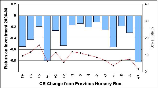
Losses all round and higher Strike Rates for horses going up the handicap. Perhaps what you would expect and despite the better Strike Rates those going up still produce solid losses, including the +6 changes which will include penalised winners running again before being re-assessed. The Market perhaps over-reacts to these horses because they will have obvious and very visible positives. Solid losses for those horses with larger drops and, given how cautious the handicapper is, this is what you might well expect and they really must performing very poorly or obviously over-rated to be dropped by those amounts. But, interesting to note that the lowest losses are around those horses with no change or very small ones, whether up or down. Why might that be? The chart below is in the same format and show the same data for the 2009-11 seasons.
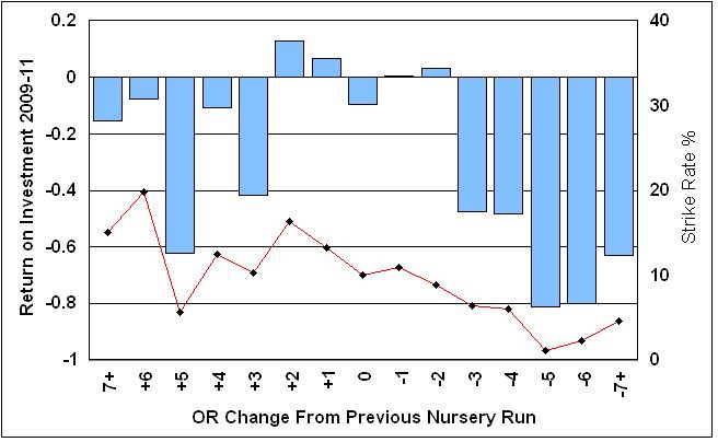
The chart for this period shows differences in each area. Horses going up by 3lbs or more still show losses but by less than before and the Strike Rates get up to 20% for 6lbs increases. Runners with drops of 3lbs or more have gone from being solid losses to absolutely deadly and huge losses. Horses on the same marks show a small loss as before. The biggest surprise comes in that either side of staying the same you would have made profits by backing every horse that had gone up, or down, 1 or 2lbs from it's previous level. Which takes some thinking about because what would the causes of this be? These horses have little in common, in general terms, beyond what the handicapper thinks of them. They will represent a huge range of trainers and sires, running at every track, on every surface and spread across all race distances.
Another question is whether the change in numbers and types of races has had some effect? Something to track for the next season. But, in some ways one of those sets of numbers where "you knows what it means" at one level, but what does it really mean? What are the real causes? One idea you might propose is that these are not 'sexy' horses on paper, averagely competitive horses running averagely well in nurseries. Punters and Tipsters often want to look for 'angles' to try to find something different in these handicaps. Or, they might want to use their pet theory which will probably end up being spread across the whole range of OR changes. These horses do not stand out and the Market perhaps underestimates them in the punter's desire to find something 'different'. But these horses have an average chance and only need to improve a little bit or get lucky in a close-knit race of Equine 'Musical Chairs' to win at, what appear to be, value odds in the long term. That is one take and there are, of course, others which could be checked.